A Visual of Current Major Market Clusters
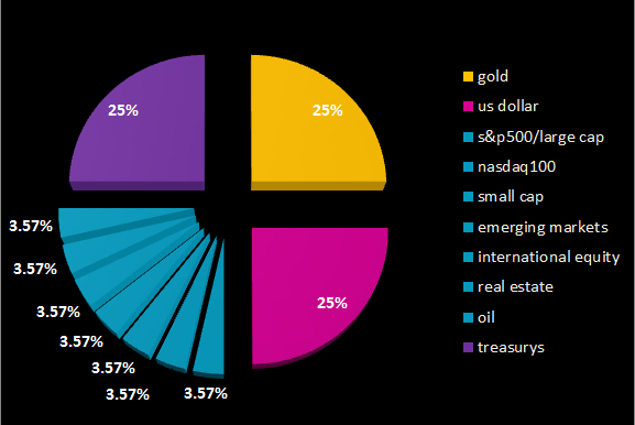
Here is a cluster representation of some of the major markets that are traded internationally. The groupings were formed using data over the past year with a clustering algorithm that is proprietary (correlation is used as a distance metric). What is interesting is that this particular cluster grouping has persisted without much change over the past 4 years. Notice that oil has behaved more similarly to equities than it has to gold. This divergence coupled with the fact that the US Dollar has behaved as a distinct cluster suggests that the market is pricing fears of currency debasement as being more likely than commodity inflation (in which case commodities and gold would be grouped together). Another explanation might lie in fact that market sentiment is currently dominated by shifts in the perception of economic growth which outweight the perceived risk of inflation. The grouping of all of the equity indices and even real estate suggest that their risk is being dominated by one or more common factors. Regardless of the explanation, I find it interesting to group clusters and then reverse-engineer a story for market expectations. Interestingly enough, using a 20-day lookback Oil has detached and formed a separate cluster apart from gold, equities and the us dollar….. not sure what to make of that!
Trackbacks
- Thursday links: tapped out theses - Abnormal Returns | Abnormal Returns
- Examples of Current Major Market Clusters « Systematic Investor
- What I’m Reading This Weekend | System Trading with Woodshedder
- Top clicks this week on Abnormal Returns - Abnormal Returns | Abnormal Returns
- Underfitting, misfitting and understanding alpha’s drivers | Math Trading


Emerging market debt is an asset class which is apparently in a cluster of its own. It had a low and sometimes inverse correlation with the equity cluster for all of 2011 and half of 2012. I am curious where would you place that.
Another distinctive asset class is inflation linked bonds. While lately (last half of 2011 and 2012) it has been closely following the treasuries, it has been mostly inversely correlated with the long bond for 2009, 2010 and half of 2011.
I was hoping that maybe you could do an update to include thoseas well. They are both bart of Dalio’s All Weather you mentioned in these pages.
hi stefan, i didn’t consider these to be major “asset classes” but rather major tradeable markets. in previous posts i highlighted
major asset class groupings (like in “All Weather”)–but perhaps I should do a post of that as well. Thanks for the suggestions.
best
david
Very interesting and thanks for sharing. Seems like some sort of principal component analysis across different markets. Is it related to the Cluster Gini Score?
About what to with it: well, trade it! 🙂 Unless I am missing something, this could just be telling you across which assets to diversify your portfolio (of strategies).
It would be interesting to see the same graph over particular time periods (e.g. 07-09 only) when correlations tend to change behaviour.
Regards,
Andrea
thanks andrea–it is not using PCA, and it can be used as an allocation algorithm or just a visual tool to understand how the markets are related. i agree, displaying the changing behaviour is important and i will do that at some point as a follow up.
best
david
Your clustering is wrong in principle because it does no take into account the distribution of risk. It also depends on lookback period.
hi Basha–it is not wrong in principle because it is not a recommended portfolio but rather a representation of different clusters. in a portfolio allocation setting you are correct–it would be necessary to risk adjust the weights, however the assumption is that the weights in the portfolio represent risk contributions anyway (equalized). the portfolio doesn’t change much unless you use much shorter lookback periods.
best
david
Hi David, Thanks for some great analysis. Does this clustering account for inversely correlated asset classes? Or do you not worry about inverse correlation?
Hi Deiya, the clustering looks at distance both within and across clusters as a function of correlation whether the correlation is positive or negative (inverse). Thus the magnitude is what is important and not the sign. Negative correlations would simply represent a greater distance between assets or clusters.
best
david