Using a Self-Similarity Metric with Intraday Data to Define Market Regimes

The images above are the famous Sierpinski Triangle and the Koch Snowflake. These objects are “self-similar” and this means that examination at finer levels of resolution will reveal the same shape. Both are examples of “fractal” geometry, and are characteristic of many phenomena in the natural world such as mountains, crystals, and gases. Self-similar objects are associated with simplicity, redundancy and hence robustness. Self-dissimilar objects are associated with complexity and chaos. Several mathematicians (including Mandelbrot) have observed that markets are clearly non-gaussian or non-normal. Markets exhibit “fat-tails” and have a distribution that shares more in common with a Levy distribution than the normal distribution which is used frequently in quantitative finance. But the market does not have a constant distribution- at times the market behavior is fairly normal in character while at other times the market is wild and unpredictable. The question is how we can effectively determine which regime the market is in so that we can apply the appropriate trading strategies to mitigate risk.
The essence of self-similarity and complexity is to compare the whole to its component parts. For example lets take a square that is divided into four separate squares of equal size. The area of the larger square is equivalent to the sum of the areas of each of its component squares. The same of course is true of a one-dimensional line which is equivalent to the sum of its parts. One of the methods of identifying self-similarity in the stock market is to look at the range or the difference between the highs and the lows. We would expect that in a perfectly self-similar market the longer range would be equivalent to the sum of the ranges measured over a smaller interval. The more chaotic the market is, the greater the difference will be between these two measures. Such market conditions would be characterized by a large ratio between the sum of smaller ranges versus the longer measure of range. Essentially this relationship is called fractal dimension and is a measure of complexity. There are many different ways to measure this including using the Hurst exponent, but the problem I have always found in my own humble research is that the suggested thresholds defined by specific absolute values do not seem to reflect the information consistent with theory. I have often found that relative measures tend to be more robust and consistent- much the same way that the magnitude of past returns has less predictive value than the relative rank of past returns. Relative measures tend to be more stationary than absolute values. To compute this measure of self-similarity I use the intraday range (high minus low) versus a longer range window. Here is how it is calculated:
1) find the high minus the low for each day going back 10 days
2) take the sum of these values (sum of the pieces)
3) find the 10-day range by taking the 10-day maximum (including the highs) and subtracting out the 10-day minimum (whole range)
4) divide the sum of the pieces by the whole range- this is a basic measure of fractal dimension/complexity
5) take the 60-day average of the 10-day series of the complexity values- this is the quarterly “chaos/stability” metric
6) use either the 252-day normsdist of the z-score or the percentile ranking of the chaos/stability metric
7) values above .5 indicate that the market is in a “chaos” regime and is much less predictable and non-stationary, values below .5 indicate that the market is stable and much more predictable.
When the market is “stable” it is easier to apply effective quantitative trading systems. When the market is in “chaos” mode, it is not necessarily volatile- but rather it is too complex to use for standard measurement and calibration of basic linear prediction. Let’s look at how this measure performs over a long time period using the S&P500 as a test set. The high and low values are generally the same until about 1963 which is when we will begin this test. Here is how the market performed in both regimes over the last 50+ years:

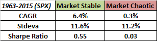
The market performs quite poorly in “chaos” conditions, and seems to make all of its long-term returns in the “stable” regime. Note however that the volatility is not materially different between both regimes- this means that we are capturing something different than just high and low volatility market conditions. Furthermore the correlation between the chaos indicator signals and for example the basic trend signal of a 200-day moving average is -.116. This means that we are capturing something different than just the market trend as well. The indicator is meant to be used to define regimes rather than as a trading signal to go long or short, but clearly there are some interesting attributes worthy of further exploration and refinement.
Trackbacks
- The Whole Street’s Daily Wrap for 3/13/2015 | The Whole Street
- Part 2: Using a Self-Similarity Metric with Intraday Data to Define Market Regimes | CSSA
- Modeling Chaos & Stability In The Stock Market | The Capital Spectator
- Parsimony | CSSA
- Performance in Stable and Chaotic Markets Based on the CSSA Regime Indicator | Price Action Lab Blog


David, what this shows is: when the trend is strong, the trend is strong :-).
The “complexity values” are identical to the “classic” Trend Strength Indicator from the late Seventies.
It should not come as a surprise that the bulk of a move is made when the net directional movement is strongest. By “filtering out” times where there is no or only a weak trend (indicator values < 0.5) what is left are the "strong trending" times and that's exactly what the table shows.
HI Helmuth, i wasn’t aware that this was a replica of another indicator–i looked and found the ADX which obviously isn’t the same. In either case I agree that this is related to some extent to trend strength. but the indicator is still invariant to whether the trend is up or down.
best
david
this looks like a momentum trend indicator… not sure I buy all this chaos marketing here.
hi buddy–lol at the marketing comment. on a serious note it is a measure of trendiness that is predictable, not per se a momentum indicator since it is indifferent to direction.
best
david
It is not fair how smart you are:-( Nice work again David!
thanks John, maybe on a good day…..:) I have my moments. thanks again,
best
david
David, can you share what trading system is used in each regime? Thanks.
Great work David. Could you post the chart in log scale so we could see the early years. Also, Aren’t the SPX daily highs and lows notoriously inaccurate. SPY highs and lows may be more accurate, but they only began in 1993. I tested this with SPY and it does appear to work.
Thanks,
James
Hi James, thank you for the kind words. it should be easy to compute and do that chart in excel in log scale. i agree that the highs and lows are inaccurate early on, the spy shows much better performance.
best
david
David thank you for sharing your ideas and research,
One potential problem that may arise with different techniques is what to do when their signals diverge. For example, if I have implemented the algo correct, “Self Similarity” signals that etf HEDJ is currently (and since 10th of Feb 2015) in a chaotic regime. This signal comes into contradiction with the signal we get from Momentum indicators (eg. SMA, Percentile Channels), and in this case would have led us to miss a near 10% rally. Even if my implementation is wrong the selection problem is there.
hi Nick thank you for the kind words. I can’t comment on your implementation but I will say that the chaos indicator is not trying to identify a bull or bear trend per se. it also does not need to be binary. one can assume that a trend signal is stronger in a stable market and weaker in a chaotic one, this would imply a smaller position. in either case- nothing is going to be correct with 100% accuracy.
best
david
David,
I just noticed it “the correlation between the chaos indicator signals and for example the basic trend signal of a 200-day moving average is -.116” and “The indicator is meant to be used to define regimes rather than as a trading signal to go long or short”
David,
Using fractal dimension as a metric is not something I had considered before, but it makes intuitive sense. A couple questions as I start to investigate this myself:
1) Have you looked at this using intraday data?
2) Do you see roughly similar results using other, more traditional measures of self-similarity or fractal dimension?
Hi Ben, no I have not tested using intraday data. I don’t see the same results using other more traditional measures based on what i have tested- this one tends to be superior. But I have not explored the wide range of methods that exist. This one seemed to make sense to me.
best
david
Also, the fact that it is neither correlated to L/T trend nor volatility surprised me… my guess that there would have been at least a moderate degree of correlation. That could make it a very valuable metric indeed.
One thing this is not capturing is the effect of overnight moves, which often account for a lot of the total price movement. It might make sense to include the overnight range as part of the day’s range (e.g. include prior close as possible H/L). You are capturing daily range but that is sometimes not where the action is… Just a thought.
@Hellmuth Vollmeier
you make some good points, and this can be modified to take into account open and close values to account for that.
best
david
If I understood correctly, here is the r code for the metric*
symbol <- "SPY"
data = new.env()
getSymbols(symbol, from="2005-01-01",env=data,auto.assign=T)
data.high = data[[symbol]][,paste(symbol,".High",sep="")]
data.low = data[[symbol]][,paste(symbol,".Low",sep="")]
data.close = data[[symbol]][,paste(symbol,".Close",sep="")]
data.ad = data[[symbol]][,paste(symbol,".Adjusted",sep="")]
data.ret = ROC(data.ad,type="discrete")
data.high = data.high * as.numeric(data.ad)/as.numeric(data.close)
data.low = data.low * as.numeric(data.ad)/as.numeric(data.close)
data.range = data.high – data.low
data.range = rollapply(data.range,10,sum,fill=FALSE)
data.range.2 = rollapply(data.high,10,max,fill=FALSE) – rollapply(data.high,10,min,fill=FALSE)
tmp = data.range / data.range.2
tmp = SMA(tmp,60)
tmp.z = (tmp – SMA(tmp,252))/rollapply(tmp,252,sd)
tmp.p = pnorm(tmp.z)
colnames(tmp.p) = c("Choas.Stability.Metric")
You don’t think it should be:
data.range.2 = rollapply(data.high,10,max,fill=FALSE) – rollapply(data.low,10,min,fill=FALSE)
yes
thanks Patzoul for sharing the code–much appreciated!
best
david
Thanks for the code. The quantmod library is being used. I think the line
data.ret = ROC(data.ad,type=”discrete
should be
data.ret = ROC(data.ad,type=”discrete”)
rollapply for a max? runMin and runMax are your friends.
What was the percentage of time the SP was in chaos based on this indicator?
by my calculations 66% of the time the SP was in chaos since 1962
hi Shasha, i believe it was close to 50/50 ratio–or not materially different from 50% since it is a relative indicator (normalized)
best
david
Thank you for the indicator David. I used it to filter both a countertrend and trend-following system and it improved the results more than either trend or volatility filters I’ve used in the past. I’ve experimented with the Hurst coefficient but never had much luck using it. Thanks again.
hi Jrt, thank you for the kind words– glad you found some use for the indicator.
best
david
Hi David, please don’t take this comment the wrong way. I am a fan and hope that my comments will be useful. I think the indicator is indicating if the market has been trending over the recent period or in a corrective/sideways phase not necessarily a chaotic state. If the price were oscillating in a perfect sine wave over the shorter-term then the ratio would be higher, however the price would be perfectly stable (1 perfectly predictable dimension to the price in this hypothetical case). If the price was forever in a linear uptrend then it would also be perfectly stable, but the ratio would be lower.
I’ve seen a professor, during an online course, talk about using principle components analysis (or similar) to detect/predict when a system is moving into a chaotic state. I have never attempted it myself though.
Kind Regards,
James
I think David is correct. In price series analysis, the trend shows stability and no trend shows chaos.
hi George, that is correct it is more of a trendiness measure.
best
david
hi James, thank you and hope you are well-been a long time. no offense taken whatsoever–it is just an idea, mainly to identify information in market data rather than being purely descriptive of chaos/stability. the concept is just related to fracticality and randomness. the PCA stuff you refer to is probably the absorption ratio by Kritzman which has conceptual merit but in testing has not demonstrated much power.
best
david
David, thank toy very much!! It must be best indicator) Can you help me? What librarys use for R code?